letterpress: a little rant.
Peter Koch's letterpress work, especially his ephemera, is so. damn. fine.
Here's the thing.
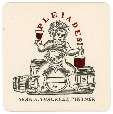
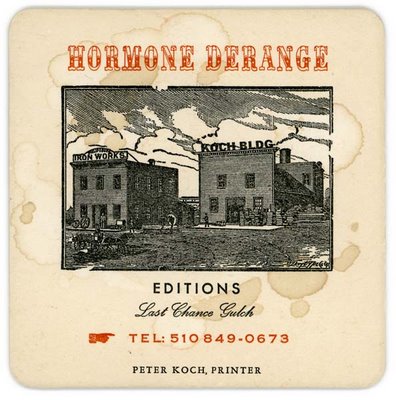
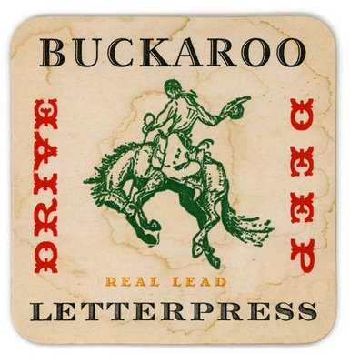
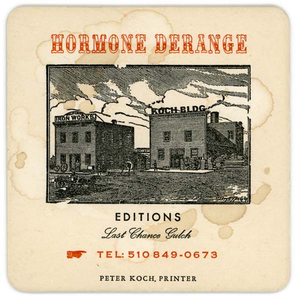
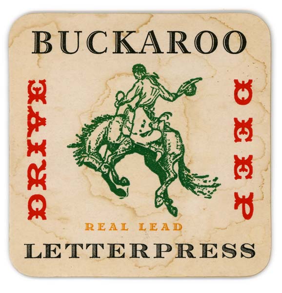
I like rough, mad, brazen letterpress. I like my letterpress single-malt, straight up. I like it with lots of typeface-- really amazing, old-school typeface. and I like it used, splotchy, like it's been somewhere. I don't want it pristine. I don't want it pretty. I don't want it cutesy retro. I want it unapologetically regressive, so out-of-date that it's not. I want it devil-may-care, with fire in its belly.
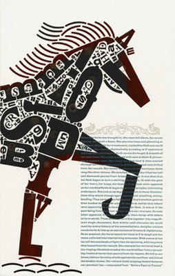
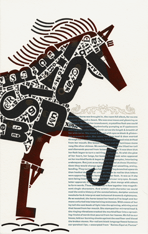
Typographical Horse, designed and printed by Christopher Stern, of the WA-based letterpress Stern & Faye.

Here's the thing.
I like rough, mad, brazen letterpress. I like my letterpress single-malt, straight up. I like it with lots of typeface-- really amazing, old-school typeface. and I like it used, splotchy, like it's been somewhere. I don't want it pristine. I don't want it pretty. I don't want it cutesy retro. I want it unapologetically regressive, so out-of-date that it's not. I want it devil-may-care, with fire in its belly.
Typographical Horse, designed and printed by Christopher Stern, of the WA-based letterpress Stern & Faye.
Labels: letterpress, so damn fine
posted by Phoebe at 3:56 PM
![]()
![]()


1 Comments:
I absolutely love this. I'm going to put your wonderful blog on my morning coffee visits. k
Post a Comment
<< Home